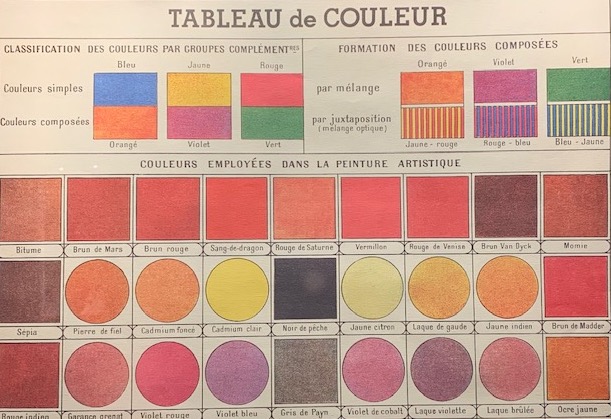
(English translation below)
I colori sono gli estremi dei viaggi, i loro riassunti: li illustrano, li codificano, e ci permettono di viaggiare addentrandosi nei loro meandri infiniti.

Giallo rosso e blu: ad Angelo Cricchi bastano poche parole e una combinazione cromatica e il viaggio trova la sua esatta misura. Sono tre colori, è l’America. 

Qual è il colore della guerra in Ucraina? Il grigio della distruzione, il grigio e il verde dei veicoli militari, il rosso del sangue. L’Africa è sempre stata ocra-ocra-ocra, come la sua terra, ma anche il verde-verde-verde delle sue sconfinate foreste. Venezia è il salmone scuro dei mattoni dei suoi palazzi e il verde scuro delle sue finestre. Firenze è marrone, come il bugnato e le pietre delle strade.

Roma è più abbagliante, e Parigi argento, la Svezia ha il rosso intenso dei pigmenti usati per colorare quelle case di legno che si trovano solo lì. Alcuni abbinamenti sono indiscutibili: il bianco della neve e dei ghiacciai alpini, il blu o il grigio di certi mari, il bianco e il blu della Grecia, già espliciti nella bandiera.

Ogni luogo ha un colore dominante, a volte inscritto nella sua storia, nei materiali utilizzati, o negli elementi della natura, altre volte nella memoria personale, plasmata da piccole o grandi epopee individuali. Ognuno di noi ha la sua tavolozza, i suoi appunti di viaggio cromatici.

Già la terminologia è anche un manuale di geografia: Terra di Siena, Viola Bordeaux, Blu Capri, Blu Alaska, Rosso Cayenna, Argento romano… E così, vagando per il mondo, i nostri occhi sono costantemente sollecitati da un atlante cromatico, con tinte uniche o abbinamenti destinati a restare impressi e a rivelarci il sapore preciso del luogo, come nella visione americana di Angelo Cricchi.

Cataloghiamo – materialmente (fotografie e altro) e mentalmente (ricordi) – per spazio e per tempo, per luoghi e per date, ma quanto sarebbe più bello farlo per colori: i paesi e i periodi del nero, quelli dell’oro. 

Ma non si fa. Ci circondano e li diamo per scontati, mentre soprattutto quando viaggiamo dobbiamo osservarli e lasciarci pervadere dai colori. Per avventurarci nelle loro lande non occorre nemmeno partire – basta immergersi in veri e propri viaggi fermi, ai quali è dedicata una letteratura limitata.

Maria Morganti realizzò per anni e anni alla Fondazione Querini Stampalia un Diario cromatico. Ci guida nel suo metodo:

“Ascoltare l’altro. Entrare nell’altro, nel colore, e lasciarlo esistere così come è. Non dirigo il colore, non lo costruisco. Non lo progetto. Non lo penso per come sarà. Lo ascolto e lo vedo farsi. Lo vedo nascere sulla tela”.

Ci fa scoprire la città per colori:

“Venezia, città minerale, diventa visibile ogni  giorno in una luce cromatica unica e speciale. Slavata dal sole, dall’aria salmastra e dall’acqua di mare, macchiata dalla pioggia, i suoi colori si consumano e le tonalità si raffinano abrasi dal tempo. Specchio nelle onde Venezia è una città di indeterminatezze. 

I colori dei suoi canali nascono da una luce che si insinua e si intensifica nella pietra madrepietra e nello stucco sbiadito : turchese opalescente, verdi lattiginosi. 

I colori equorei della laguna riducono e brillano in perpetua reazione alla luce marina, incessantemente mutevole, all’immobilità o turbolenza dell’aria, alle maree in cui si impigliano i mutamenti senza fine di sole e ombra di numi: le tonalità azzurromare o verderame, ora scure, ora vivaci, argento, grigio, bianco e nero screziato. 

Ovunque in città è il fascino del marmo, barlume bianco, meravigliosa eau-de-nil increspata e rosa pallido di antichi sedimenti marini solidificati.

Sui tetti vediamo i quasi rossi e i rosa della terracotta, cupole di bronzo, verderame, grigio piombo”. 

Sempre a Venezia, Luciana Boccardi pubblicò alcuni preziosi volumetti dedicati a singoli colori che sono altrettanti viaggi: il verde dei nomadi e quello dell’islam, il bianco che in ogni cultura è alfa e omega di vita e morte – vestito del neonato, della sposa, sudario. E poi il blu dei blues afro-americani, il rosa del pensare in rosavedere rosaperiodo rosa, la vie en rose.

Sono solo frammenti. Il colore – così impalpabile e così vero – permette traversate infinite. L’artista giapponese Sanzo Wada (1883-1967), avanguardista e costumista, nei due volumi del suo Dictionary of Color Combinations inventa un genere letterario.

Accosta strisce colorate, scompone oggetti in base ai loro colori, risveglia i nostri sensi assopiti davanti all’emozione di un viola congiunto col verde, apre traiettorie inesauribili. Alla fine del suo personalissimo viaggio, ognuno approda dove crede, magari nel verde degli alberi, ripreso non a caso anche nel tavoli dei giocatori, per calmare i nostri sensi eccitati. 

ENGLISH VERSION

Three books teach us to travel by colors

Colors are the extremes of travels, their summaries, they illustrate them, encode them, and allow us to enter un their infinite meanders.

Yellow, red, and blue: to Angelo Cricchi just a few words and a chromatic combination and the journey finds its exact measure. Just three colors, and here it is America.

What is the color of the war in Ukraine? The grey of destruction, the grey, and green of military vehicles, and the red of blood. Africa has always been ocher-ocher-ocher, like its land, but also the green- green-green of its endless forests. Venice is the dark salmon of the bricks of its buildings and the dark green of its windows. Florence is brown, like the rustication and the stones of the streets.

Rome is more dazzling, and Paris silver, Sweden the intense red of the pigments used to color those wooden houses that are only found there. Some combinations are indisputable – the white of snow and alpine glaciers, the blue or grey of certain seas, the white and blue of Greece, already explicit in the flag. Each place has a dominant color, sometimes inscribed in its history, in the materials used, or in the elements of nature, other times in personal memory, shaped by small or large individual epics. Each of us has his own palette, his chromatic travel notes.

The terminology is already a manual of geography: Sienna, Bordeaux Purple, Capri Blue, Alaska Blue, Cayenne Red, Roman Silver … And so on, wandering around the world, our eyes are constantly solicited by a chromatic atlas, with hues unique or combinations designed to be impressed and to reveal the precise flavor of the place, as in the American vision of Angelo Cricchi. We classify – materially (photographs and more) and mentally (memories) – by space and time, by places and by dates, but how much more beautiful it would be to do it by colors: the countries and periods of black, those of gold.

Yet, this is not how we proceed. Colors surround us and we take them for granted, while especially when travelling we must observe them and let ourselves be pervaded by them. To venture into their lands, you don’t even need to leave – you just need to immerse yourself in real stationary journeys, to which limited literature is dedicated.

Maria Morganti made a Chromatic Diary at the Querini Stampalia Foundation. She guides us in her method: “Listening to the other. Entering the other, the color, the color, and letting it exist as it is. I don’t direct the color, I don’t build it. I don’t design it. I don’t think so as it will be. I listen to it and I see it happening. I see it being born on the canvas”. She makes us discover the city through colors: “Venice, a mineral city, becomes visible every day in a unique and special chromatic lice. Washed out by the sun, the salty air and sea water, stained by the rain, its colors wear out and the shades are refined worn by time. Mirror in the waves Venice is a city of uncertainties.

The colors of its channels arise from a light that creeps and intensifies in the mother stone and in the faded stucco: opalescent turquoise, milky green.

The equine colors of the lagoon reduce and shine in perpetual reaction to the incessantly changing sea light, to the immobility or turbulence of the air, to the tides in which the endless changes of sun and shadow of gods get entangled: the shades of blue or verdigris, now dark, now vivid, silver, gray, mottled black, and white.

Everywhere in the city is the allure of marble, white glimmer, gorgeous rippling eau-de-nil, and pale pink of ancient solidified marine sediments.

On the roofs we see the almost reds and pinks of terracotta, bronze domes, verdigris, lead-gray”.

Also in Venice, Luciana Boccardi published some precious volumes dedicated to single colors that are also a form of journeys: the green of the nomads and that of Islam, the white that in every culture is the alpha and omega of life and death – the dress of the new-born, the bride, the shroud. And then the blue of the African-American blues, the pink of thinking in pinkseeing pink, the pink period, la vie en rose.

Individual colors are just fragments. The color – so impalpable and so true – allows infinite crossings. The Japanese artist Sanzo Wada (1883-1967), avant-garde and costume designer, in the two volumes of his Dictionary of Color combinations invents a literary genre.

He juxtaposes colored stripes, breaks down objects according to their colors, awakens our dormant senses in front of the emotion of purple combined with green, and opens inexhaustible trajectories. At the end of his very personal journey, everyone arrives where he believes, perhaps in the green of the trees, taken up not by chance but also in the players’ tables, to calm our excited senses.

Condividi: